Carolinéale
type design
Originally the result of a research project on the Carolingian minuscule, coined in the Frankish monasteries of the 8th and 9th centuries, as well as on the musical notation systems of the time, Carolinéale subsequently undertook a seven-year process to evolve into a versatile sanserif of contemporary elegance. However, its voice still conveys a subtle touch of history. Equipped with all the typographic goodies the discerning typographer could need, Carolinéale is both a comfortably legible text face and a powerful display type that will stimulate readers at larger sizes.
Carolinéale is distributed by the PampaType type foundry
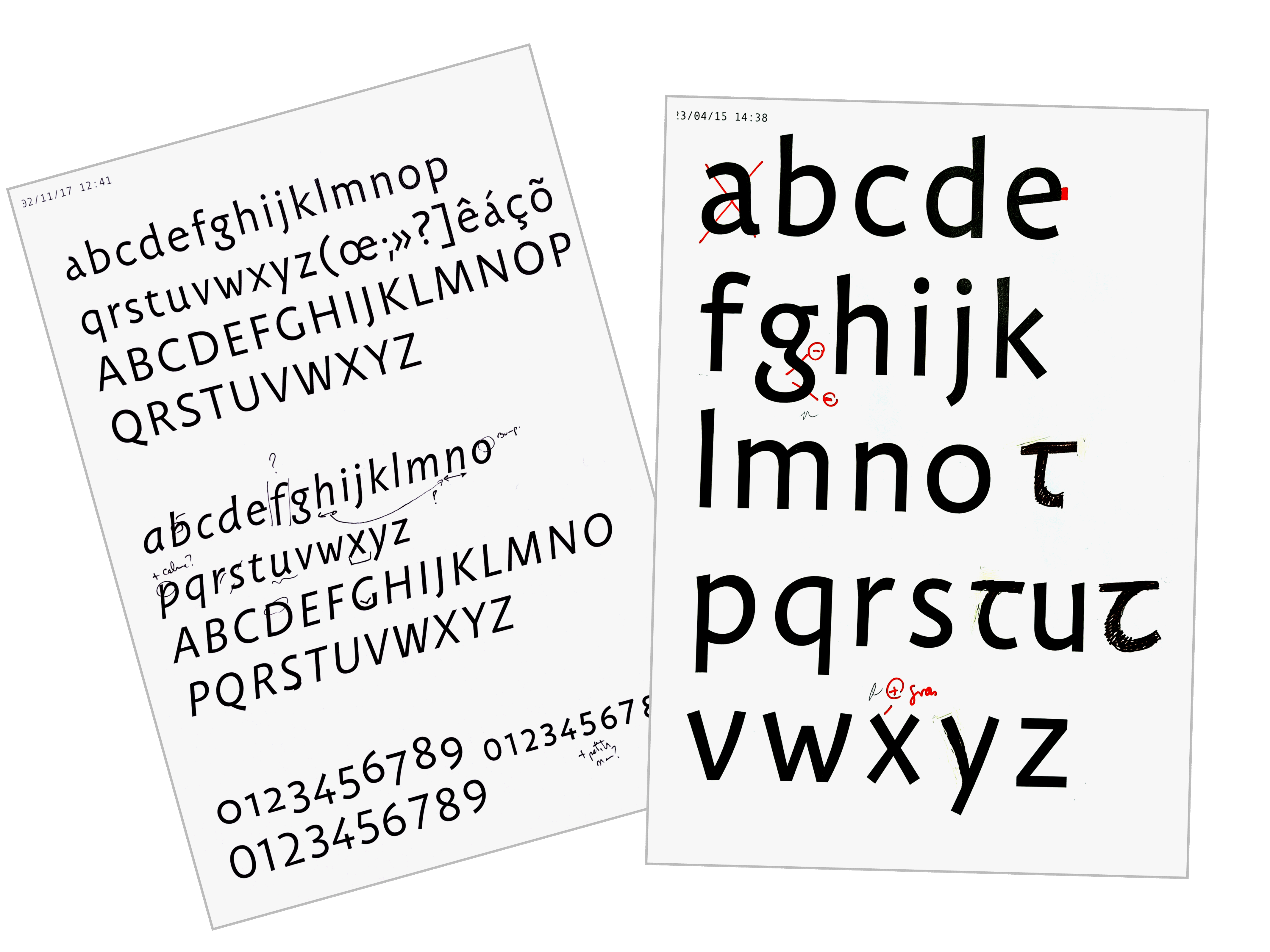
The roman font of Carolinéale is based on the most symptomatic forms of the Carolingian minuscule. Its italic s thought of as a companion to the roman. It seeks to distinguish itself and bring a new voice at the sentence level, while preserving harmony and coherence at the paragraph level.

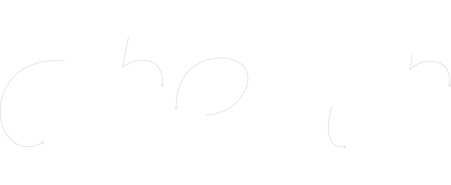
often require fewer pen strokes to draw.
The entries and exits of letters are calligraphic
whenever possible and their structure is derived
from a faster tracing of strokes.
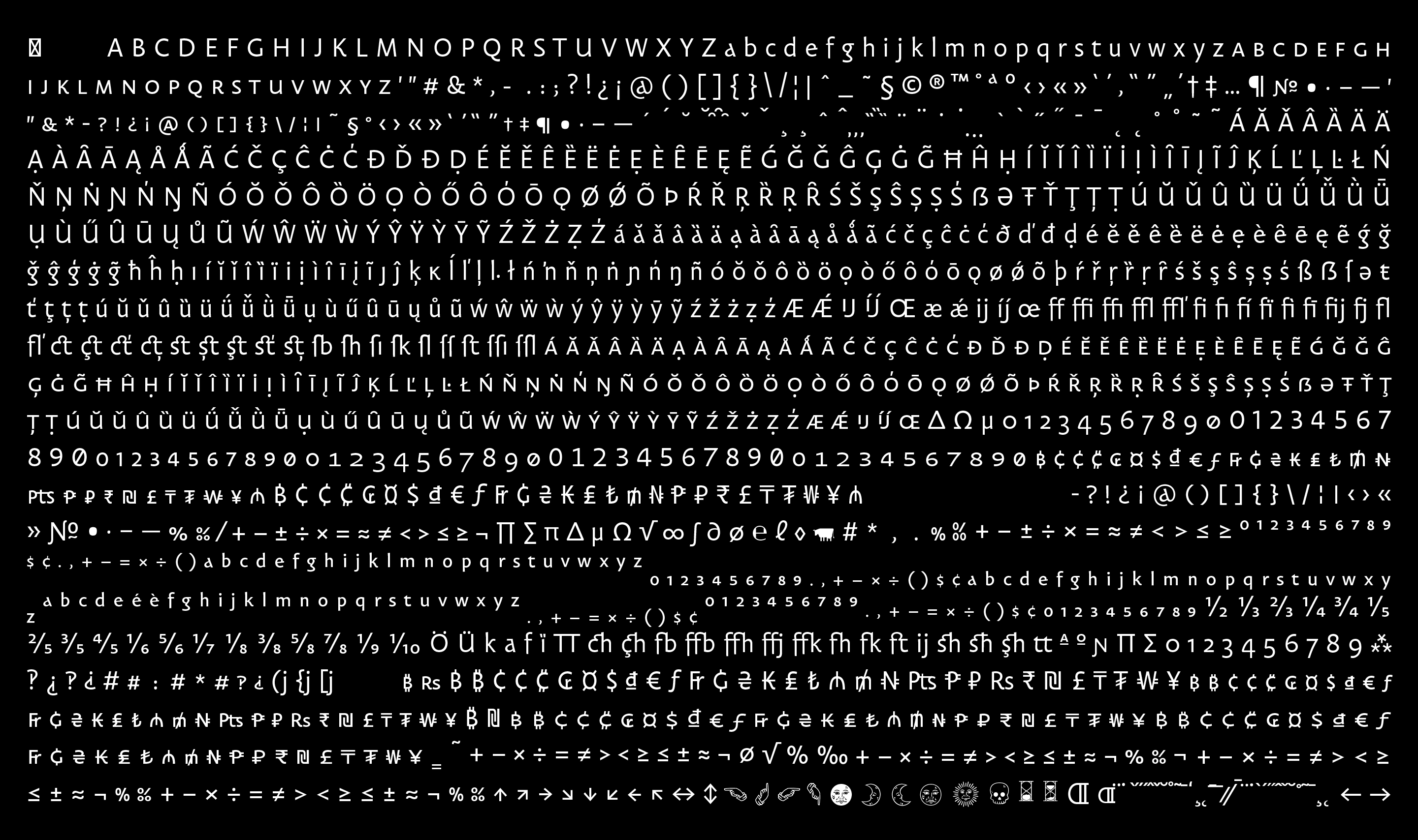
Following PampaType’s inclusive policy, Carolinéale acquires the extended Latin character set, exceeding 1400 glyphs.

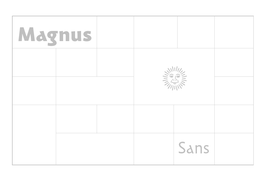
Carolinéale glyphs all have in their constructions a more or less present trace of a handwritten origin. Each sign seeks to find a satisfactory point of balance, somewhere between the vocabulary of a contemporary sanserif and that of medieval calligraphy.
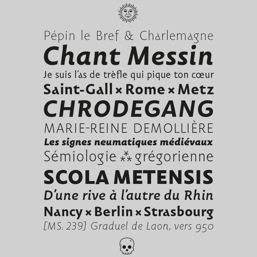
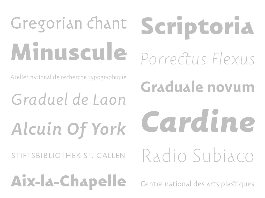
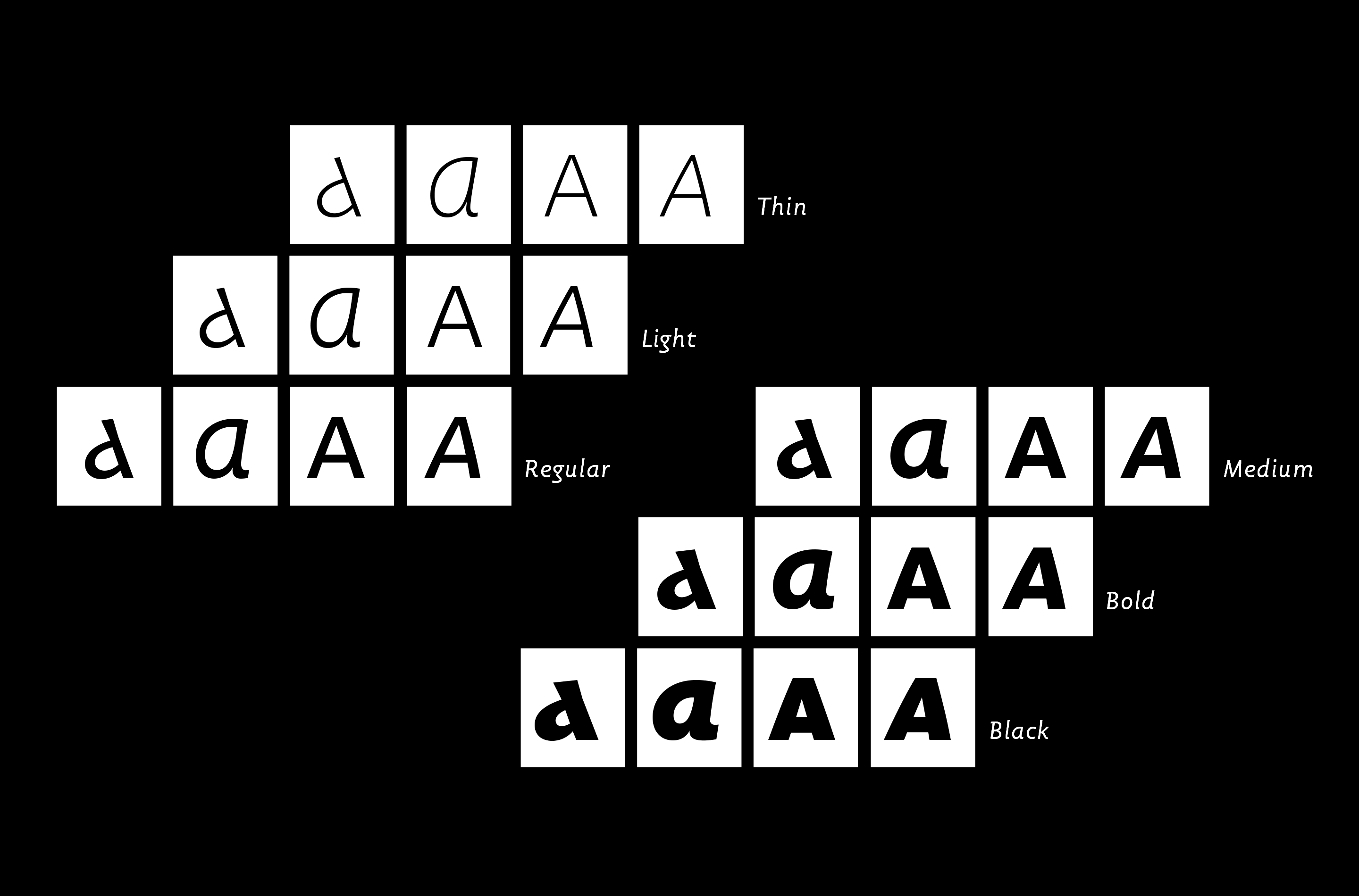
Carolinéale has several carefully distributed and differentiated weights, ranging from thin to black, in order to respond to all editorial situations.
Find out more and buy a license of the type family on www.pampatype.com